Sallie’s car broke down and she wasn’t able to attend the January meetup to present the WordPress 3.8 feature tour, so Anca took over. In lieu of slides, here is the official video from WordPress.
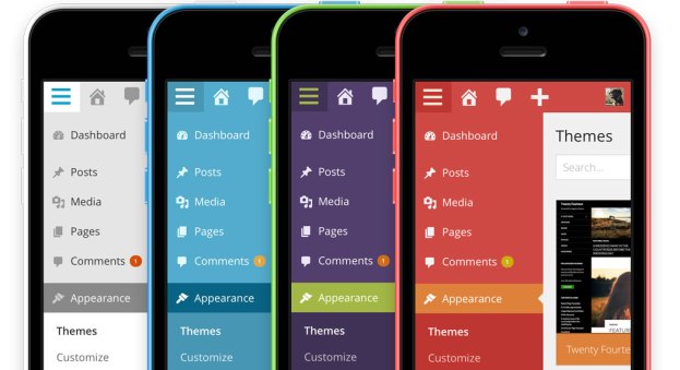
Introducing WordPress 3.8 “Parker”, a release — named after Charlie Parker — that introduces a redesigned, responsive admin, theme browser, and a new magazine theme, Twenty Fourteen. You can learn more about the release here.
Some Links
Official Announcement, December 12, 2013
Version 3.8 of WordPress, named “Parker” in honor of Charlie Parker, bebop innovator, is available for download or update in your WordPress dashboard. We hope you’ll think this is the most beautiful update yet.
The Design of WordPress 3.8 (Matt Miklic)
Matt explains the redesign of the admin interface, which started life as the MP6 plugin:
From the outset we knew that we wanted to create an evolution, not a revolution, of WordPress. So we kept the basic structure and layout of items the same, but rethought their visual treatment. We used a unified color for the top toolbar and sidebar menu, more clearly separating navigation from content. We un-rounded corners, simplified shadows and gradients, and eliminated other visual effects, but did so carefully, while maintaining a sense of hierarchy and depth, and without flattening elements like buttons and form fields beyond recognition. We also used color judiciously to indicate activity and state, so something like an alert message or an activated plugin is easy to discern at a glance.
Meet WordPress 3.8, “Parker” (Post Status)
Brian Krogsgard comments on the development cycle as well as the new features:
This is the second rapid release cycle for WordPress, and the shortest time between major versions ever. Though with the shift to features-as-plugins driven development, the development cycle (a subtle but significantly different thing than the release cycle) has been a more standard four months. As most readers will know, WordPress 3.8 development started at the same time as WordPress 3.7.
I’m not sure how often this will be done in the future. It appears to me that simultaneous development cycles, while it worked well, may be rather unique to the type of releases WordPress 3.7 and 3.8 have been. I would suspect that in the future, we’ll still see shorter times between release cycles, but perhaps not as often see full-on simultaneous development between major versions.
However, it seems pretty clear that we will see features-as-plugins sometimes span multiple major release cycles as they prepare for the proposal process and core merging. I hope that this makes for a less stressful environment for new contributors to get involved in WordPress core development.
What’s New in WordPress 3.8 (SitePoint)
SitePoint praises the overhaul of the admin interface:
The interface is noticeably faster than previous versions. Most pages weigh in at less than 300Kb (compressed) with the bulkiest rarely exceeding 500Kb. I suspect it could go a little further if the team switched from JavaScript-based animations to CSS3 but it remains impressive.
Smartphone and tablet access has been significantly improved. I recommend you try it. In my opinion, it’s superior to native iOS and Android WordPress apps which rarely work as you expect or support plug-in functionality.
WordPress 3.8 “Parker” Released (WordPress Tavern)
Jeff Chandler notes that
Version 3.8 has been in the oven for 49 days. This marks the second release that contains features that started off as plugins first, a development practice we’ve covered on WPTavern at great length. It’s important to note that after upgrading to WordPress 3.8, you are strongly encouraged to disable and remove any of the features that started off as plugins.
WordPress Twenty Fourteen Theme Is out in the Wild (WordPress Tavern)
What Sarah Gooding meant by “out in the wild” was “available on WordPress.com, though users of self-hosted WordPress could download the 3.8 beta and use the theme that way. There’s a very important and still-useful link in that article: to the Theme Showcase page on WordPress.com, which provides all the information you need to know to set up the theme.
Quick Specs (all measurements in pixels)
- The main column width is
474. - Featured images work best with images that are least
1038wide. - The primary sidebar (left) width is
162. - The secondary “content” sidebar (right) width is
306. - Widgets in the footer widget area are
255wide. - The header image size is
1260wide and240high. - Single image pages are full-width and
810wide.


Leave a Reply