The April 2017 East Bay WordPress Meetup addressed two powerful method of laying out HTML objects with CSS: the Flexible Box Model, better known as “Flexbox” (display: flex), and CSS Grid (display: grid). Flexbox is a widely-supported tool for layouts along one axis; Grid is designed to lay out objects on two axes. Both introduce new concepts and terminology.
Falling in Love with Flexbox
“Falling in Love with Flexbox” was first presented at WordCamp Sacramento 2016. It covers basic Flexbox terminology and demonstrates how to use Flexbox for equal-height rows, vertical centering, and more, with examples from production websites. Get the code used for these layouts from GitHub.
When to Use Flexbox
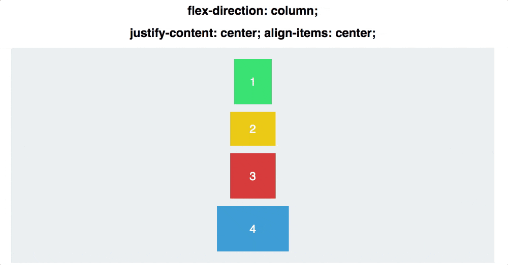
Flexbox is intended to lay out content along a single axis, either vertical (flex-direction: column) or horizontal (flex-direction: row). Rows and columns can wrap to adapt to different screen sizes. It’s possible to simulate a grid layout using Flexbox, but when there aren’t enough items to fill all the rows, flex items will stretch to fill the remaining space.
Getting to Grips with CSS Grid
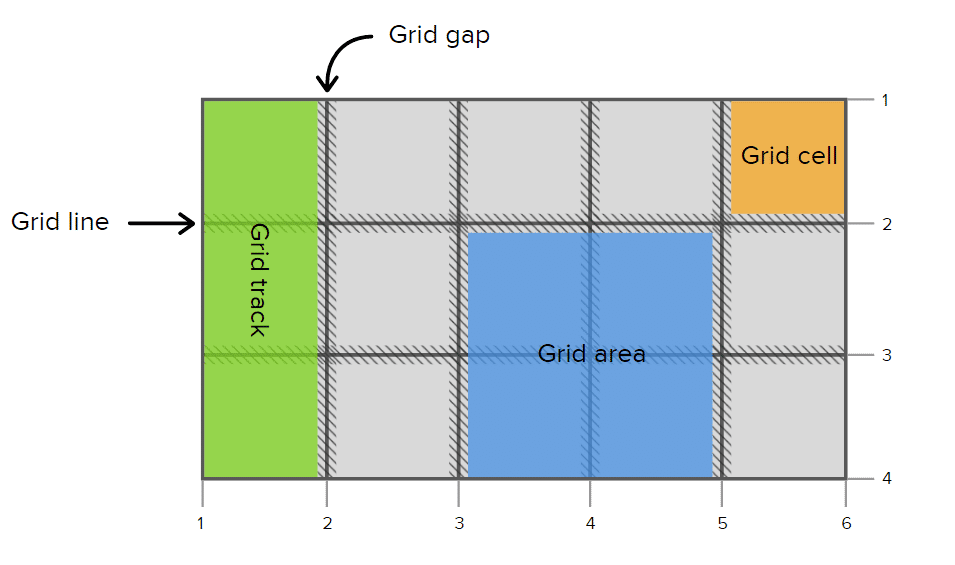
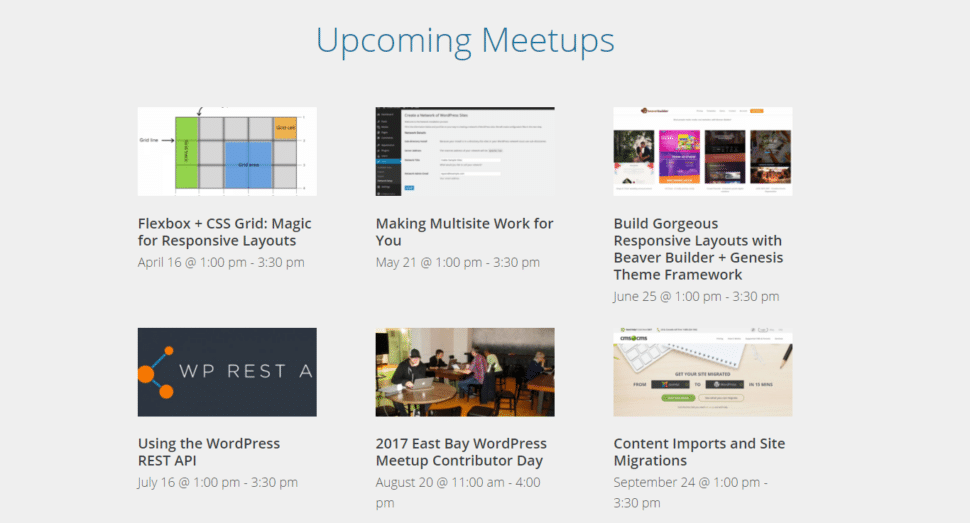
“Getting to Grips with Grid” is a very basic introduction to CSS Grid Layout and concepts like grid lines, grid rows, grid columns, grid cells, and grid areas. It includes an example of an automatic responsive grid for upcoming events, which you can see on the front page of this website (eastbaywp.com).
Grid is only supported on the most recent browsers, so unless your site visitors always use cutting-edge technology, you should use a fallback (e.g. flexbox) and put your grid layout inside of feature queries. Enter the fallback CSS first, then enclose your Grid CSS inside of a feature query, like this:
/* For browsers that don't support CSS Grid */
.home-row2 .tribe-list-widget {
	display: flex;
	justify-content: space-between;
	flex-wrap: wrap;
}

.home-row2 .tribe-list-widget li {
	flex: 1 1 240px;
}
/* For browsers that do support CSS Grid */
@supports (display: grid) {
	.home-row2 .tribe-list-widget {
		display: grid;
		grid-template-columns: repeat(auto-fill, 300px);
		grid-gap: 10px;
	}

        .home-row2 .tribe-list-widget li {
	       flex: 0;
        }
}
When to Use CSS Grid
Meetup members wanted to hear more about when to use CSS Grid instead of Flexbox. The first and most obvious case is when you want a true grid, one where elements are aligned in rows and columns. Grid items, unlike flex items, will not change width to fill the space left in a row unless you specifically tell them to. (The fr, or fractional unit, was introduced in the CSS Grid spec to do this. It sets a size at a fraction of the remaining space in a row or column.)
One example of something that would be a perfect application of CSS Grid (but that I assembled in a much hackier way) is the tiled slider on the REVA Development home page. Each slide is made up of tiles in exactly the same proportions and position.

Unlike Flexbox, CSS Grid is a tool you can use to lay out your entire web page. With media queries, you can use different grids for different screen sizes (something the above slider only manages with JavaScript.)
Note that CSS Grid, even the fascinating grid-auto-flow property, is not a replacement for Masonry. Although both Flexbox and CSS Grid allow web developers to do many things with CSS what could once only be accomplished with JavaScript, they by no means make JavaScript layouts obsolete.

Leave a Reply