We had some great demos at our “Show Off Your WordPress Site” meetup this year. Here are the screenshots, links, and some notes on the themes and plugins that make the sites work.
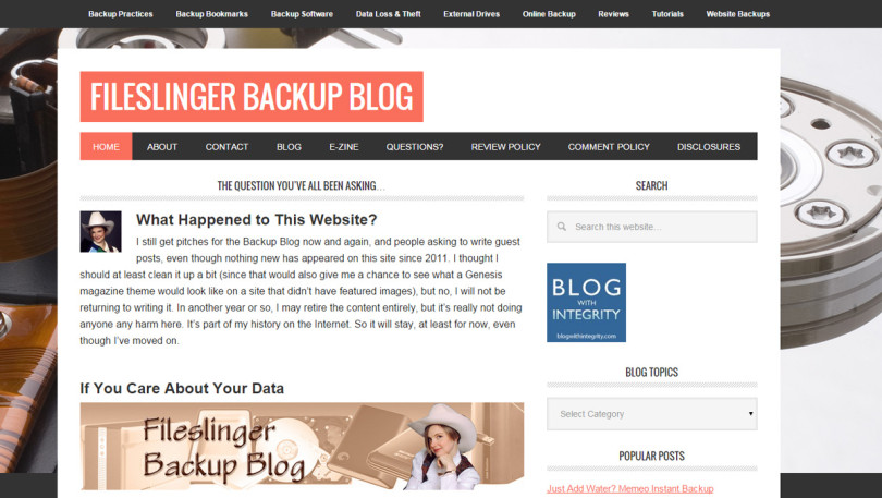
Sallie Goetsch: FileSlinger.com
Theme: Metro Pro by StudioPress
Noteworthy:
Almost all magazine theme demos use tons of enormous photos. Sallie wanted to know whether a magazine theme would work out of the box without photos. FileSlinger.com needed an overhaul anyway, and the old theme hadn’t supported featured images. (Yes, it was THAT old.) The site demonstrates that with StudioPress, at least, a magazine theme can work without featured images for the posts.
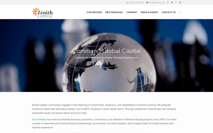
Shar Marachi: Zenith Capital
Theme: Divi by Elegant Themes
Noteworthy:
The site uses Timeline Ultimate for the News and Events page. Also, though Shar used Divi for this site, he also recommends 3 Clicks, which is $58 on ThemeForest. (One of his clients used it right out of the box.)
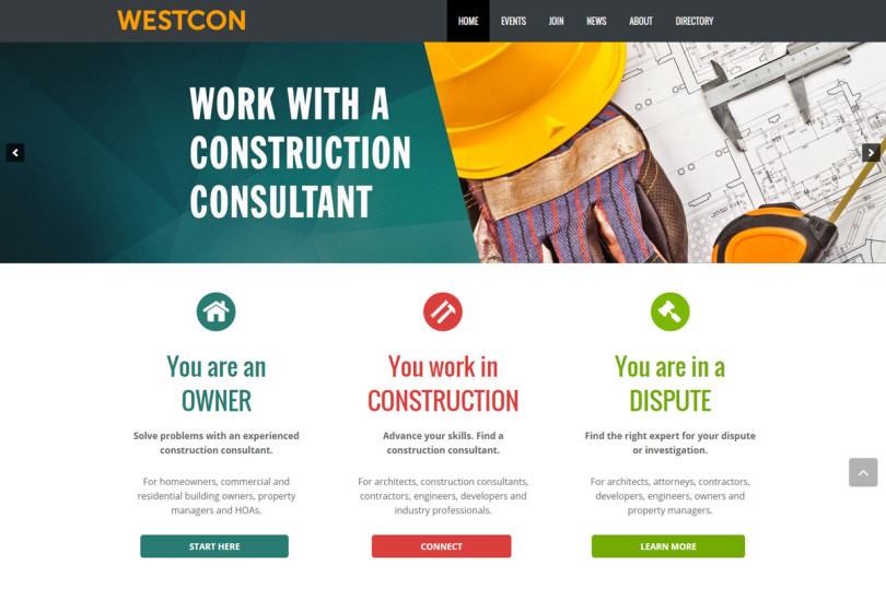
Lisa LaMagna: WestCon
http://westcon.wpengine.com (site launch delayed)
Theme: Impreza from ThemeForest
Noteworthy:
95% of condominiums end up involved in lawsuits, which is why you need a construction consultant. LaMagna Associates had to deal with 12 different customer personas, and managed by following the Rule of Three and dividing every page into 3 buckets. The directory uses the Connections plugin and events are handled with The Events Calendar.
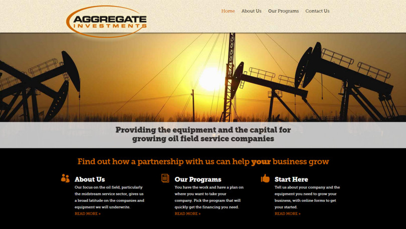
Steve Caramia: Aggregate Investments
Theme: Divi by Elegant Themes
Noteworthy:
Steve says he finds himself doing too many slider-followed-by-three-service-boxes sites, but there are enough design customizations to keep the site from looking like an out-of-the-box version of Divi. He ran into one problem with the visibility of a particular element, the answer to which turned out to be the Z-index.
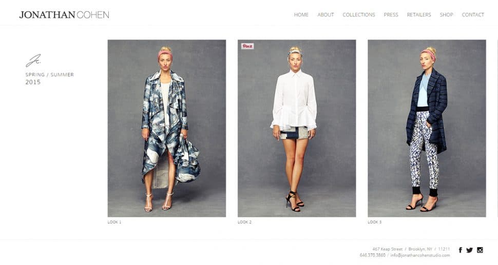
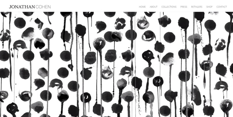
Marc Appel: Jonathan Cohen Studio
https://jonathancohenstudio.com/
Theme: Custom Design
Noteworthy:
The site needed to be able to handle massive traffic and to look good enough to match the prominence into which Jonathan Cohen was thrust by having one of his dresses worn at the Golden Globes. The design is not responsive; it was too difficult to manage the splash page and horizontally scrolling collections pages. The site uses WooCommerce for its e-commerce functions.
Marc also gave us a brief demo of http://www.n3twork.com/, a one-page site for an iOS app.
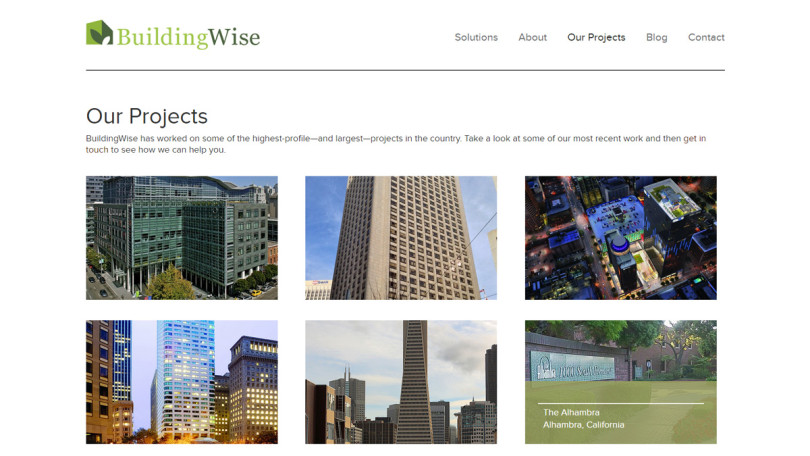
Diana Thompson: BuildingWise
Theme: Custom Design
Noteworthy:
They needed per-page sidebars that were editable by non-admins, so used the Savii Custom Post Widget plugin. (This also has the advantage of providing a normal post editing window with formatting, etc. for the widgets.) There’s also a project post type with HTML-5/CSS3 rollover titles on the thumbnails on the project archive page.
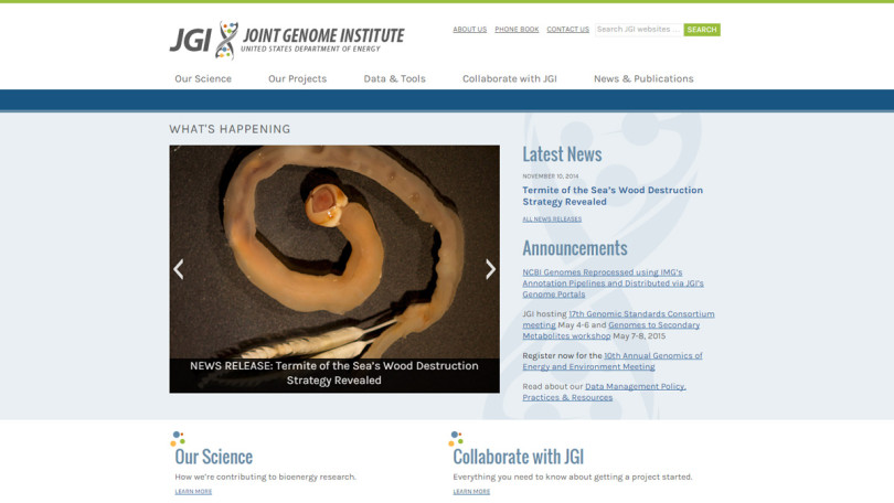
Anca Mosoiu: Joint Genome Institute
Theme: Custom Genesis Child Theme
Noteworthy:
This started out as an increasingly unwieldy HTML site, so content structure was an important factor. Sub-pages of the current page are listed in the sidebar, and each main section’s sub-sections show up as a second menu when the menu item is selected. (There are Genesis plugins to do both these things.)
There was also a need to create a special way to handle publications, an important part of any research institution’s site. (Anca is preparing the publications plugin they created for public release.)


Leave a Reply