Here’s a bibliography for the April 2017 meetup presentation about Flexbox and CSS Grid. More is being published on both of these topics all the time. You should definitely follow Rachel Andrew to keep up with Grid developments.
Mobile-Friendly Websites
Slides: Flexbox + CSS Grid: Magic for Responsive Layouts
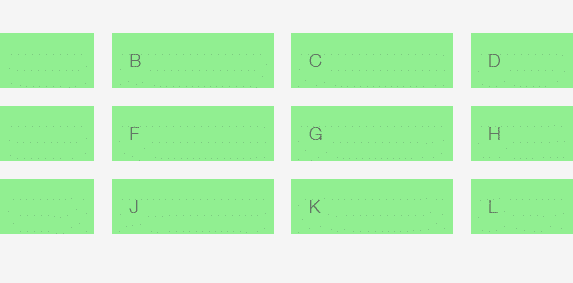
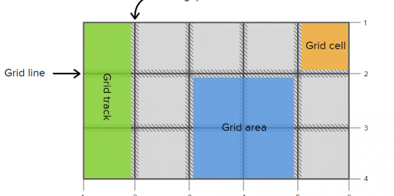
The April 2017 East Bay WordPress Meetup addressed two powerful method of laying out HTML objects with CSS: Flexbox (display: flex), and CSS Grid (display: grid). Flexbox is a widely-supported tool for layouts along one axis; Grid is designed to lay out objects on two axes. Both introduce new concepts and terminology.
Read the Post about Slides: Flexbox + CSS Grid: Magic for Responsive Layouts
Is Your (Client’s) Website Ready for 2017? (Jan Meetup Slides & Notes)
Google is laying down the law again. Are you (and your clients) ready for 2017’s requirements regarding SSL (HTTPS), popups, and Google AMP? It’s really all about mobile-friendliness. This is a search ranking trend that’s been going on even since before “Mobile-geddon” in 2015.
Read the Post about Is Your (Client’s) Website Ready for 2017? (Jan Meetup Slides & Notes)
April 2013 Slides: Building a Responsive Theme
Download Anca’s presentation and the Albedo Wireframes from the April 2013 meetup.
Read the Post about April 2013 Slides: Building a Responsive Theme
April 2013 Meetup Notes: Make Your WordPress Theme Responsive
Notes from the April 2013 East Bay WordPress meetup, including some responsive themes and other tools.
Read the Post about April 2013 Meetup Notes: Make Your WordPress Theme Responsive


