Here are Amanda’s presentation slides.
Color Systems
- Artists Primaries (red, blue, yellow)
- Process primaries CMYK (for print)
- Additive primaries (RGB)
- HSL (Hue, Saturation, Brightness)
Add white to get a tint and black to get a shade.
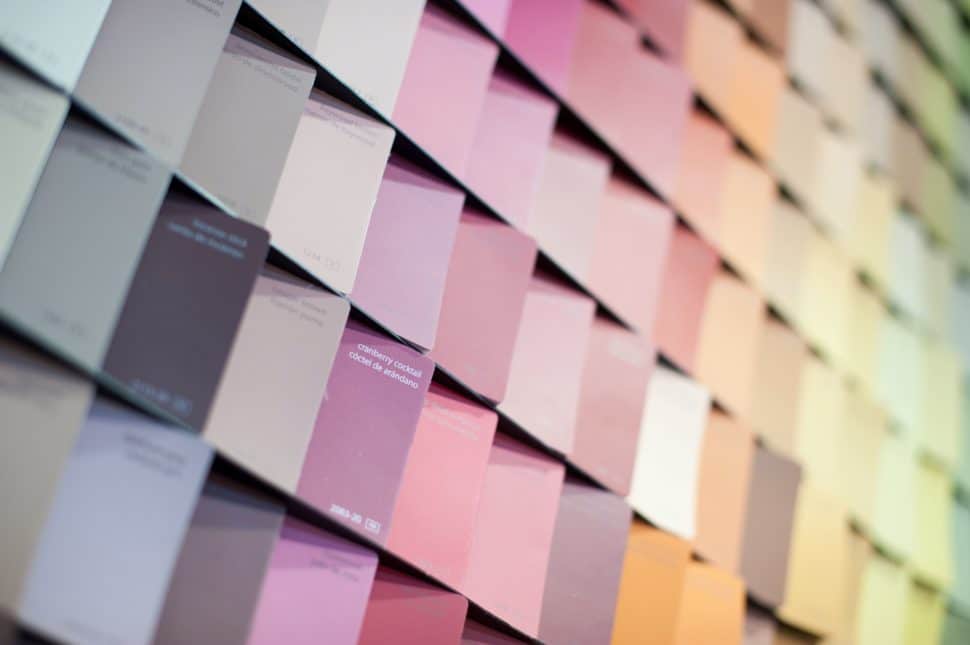
Different colors do not always have the same value at the same saturation. VALUE is an important term here. If you translated the color to black and white, how black or white would it be. Yellows are lighter value colors.
Warm colors and cool colors are always relative.
Color Wheel
Why do we have a color wheel? To create pleasing harmonies.
- Complementary colors are opposite each other on the color wheel and have the most contrast between hue.
- Analogous colors are close to each other
- Split-complementary is mellower than direct complementary
- Square gives you 4 points.
The problem with the color wheel is that it reduces the enormous complexity of color to an extremely simplistic framework.
Josef Albers, who was part of the Bauhaus, said that the thing to pay attention to is not color systems but how colors affect each other. “Color deceives continually.”
Color on screens
For print, color is expensive. On the web, color is free.
- Limit your palette
- Consider readability/legibility
- Don’t make your color too subtle
- Consider the brand
- Edit in sRGB to limit your color space
- Check on multiple devices
We have no control over what colors are really going to look like. Whatever color you put on your website, lots of people won’t be able to see it.
Think about your content
If your site is about photography, you don’t want to compete with that. Grays are good at setting off photos. For long-form text, you also don’t want a lot of color (either in the text or distracting from it, unless you WANT people distracted).
Getting at color: Start with a photograph
You can use Canva to pull color swatches out of photographs. (I’m sure there are other places that will do it, too.)
Once you have a place to start, set up a color workspace.
Check your colors on light and dark background, the colors as foreground and background for each other. (Create this color worksheet in sRGB)
Color Contrast Checker from WebAIM tells you whether you have enough contrast for readability (particularly for those who are color-blind). The smaller the text, the higher the contrast needs to be.
How Hex Works
First pair is red, second pair is green, third pair is blue. The first item in the pair is a bigger step than the second item.
Common color patterns
- Neutrals with an accent color: black/white/gray with strong color
- Subtle, high key (light) This does not translate well on a projector (most people’s projector have terrible color) If you’re creating a PPT, try projecting it from the crappiest projector in the office.
- Dark, low key (needs white type—and it does show up better in the PPT)
- Monotone (shades and tints of a single color)
- Warm colors
- Cool Colors
- Muted colors—these are rare enough on the web to be noticeable
- Saturated warm/cool contrast
- Colors with similar value (that might be harder for the color-blind)
Links
- Why does CMYK use “K” for black? https://en.wikipedia.org/wiki/CMYK_color_model
- What is sRGB? https://en.wikipedia.org/wiki/SRGB
- What is the HSV color system? http://learn.leighcotnoir.com/artspeak/elements-color/hue-value-saturation/
- What is color value? https://www.techopedia.com/definition/31848/color-value
- Anca Mosoiu’s Google Bulletin Post about the presentation

Leave a Reply